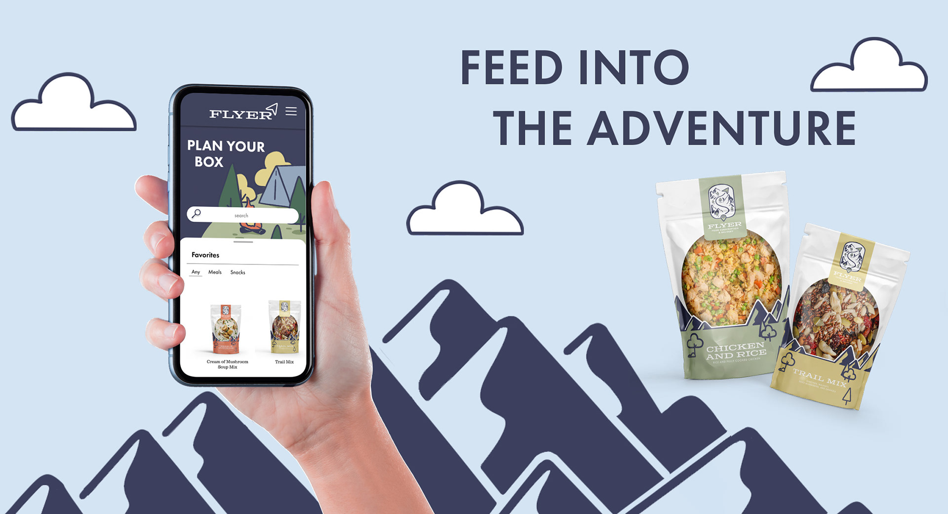
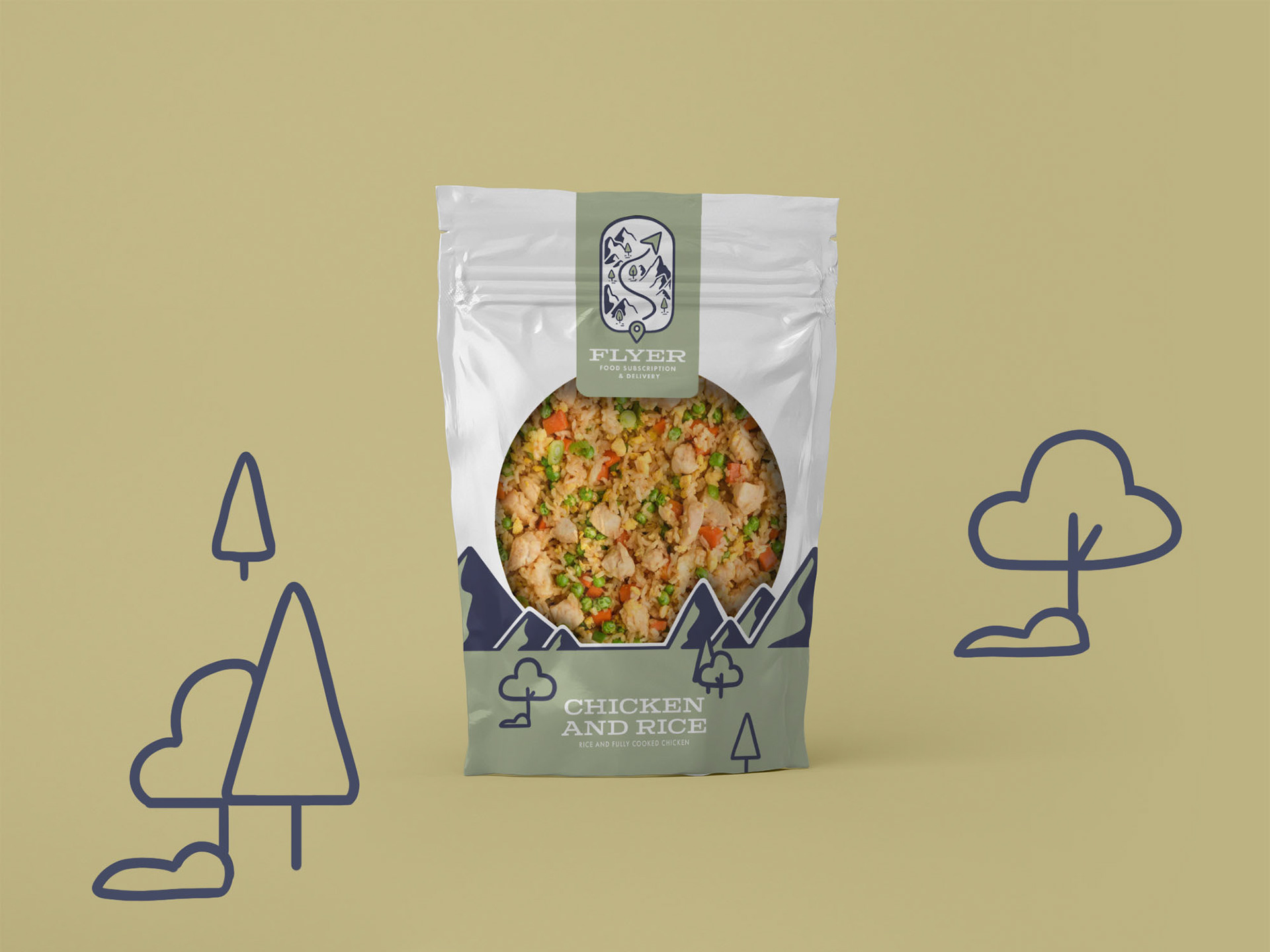
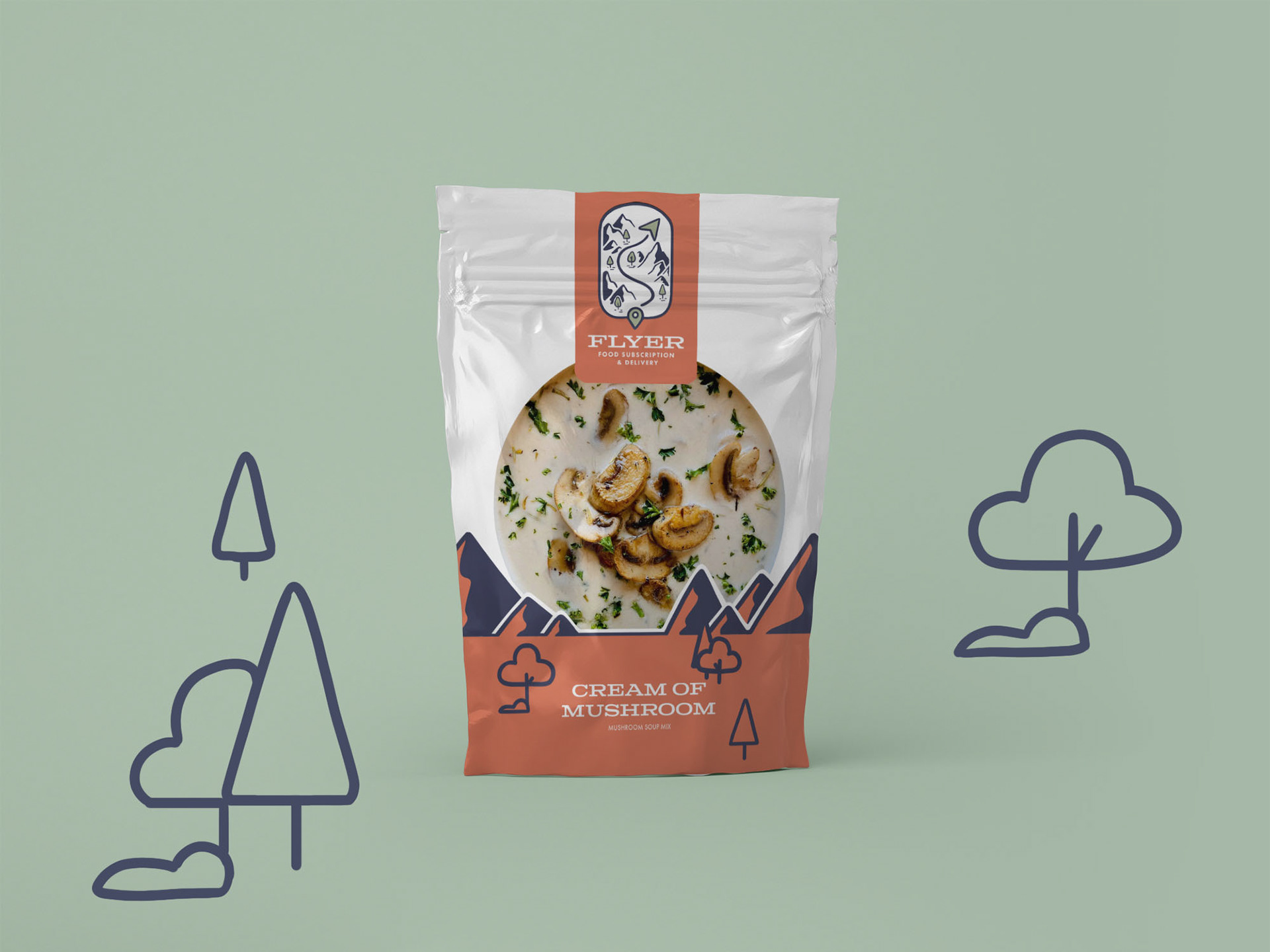
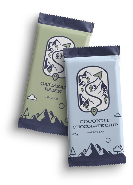
FLYER
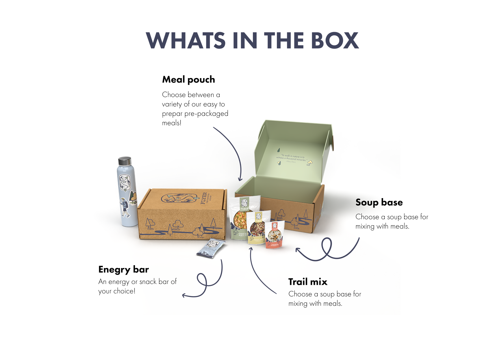
Created as a convenient alternative for backpackers who rely on picking up food by mail while hiking longer hikes, Flyer allows hikers to stress less about the planning and focus on the journey! Flyer is a food subscription based and delivery service app that allows hikers to input their planned route, stops, and dates of their journey. Hikers can then pick up their package at their chosen location when they arrive. The name for Flyer was taken from the hiking term for a box of supplies a hiker mails themselves to a location further up the trail.
Art Direction: Katey Stafford
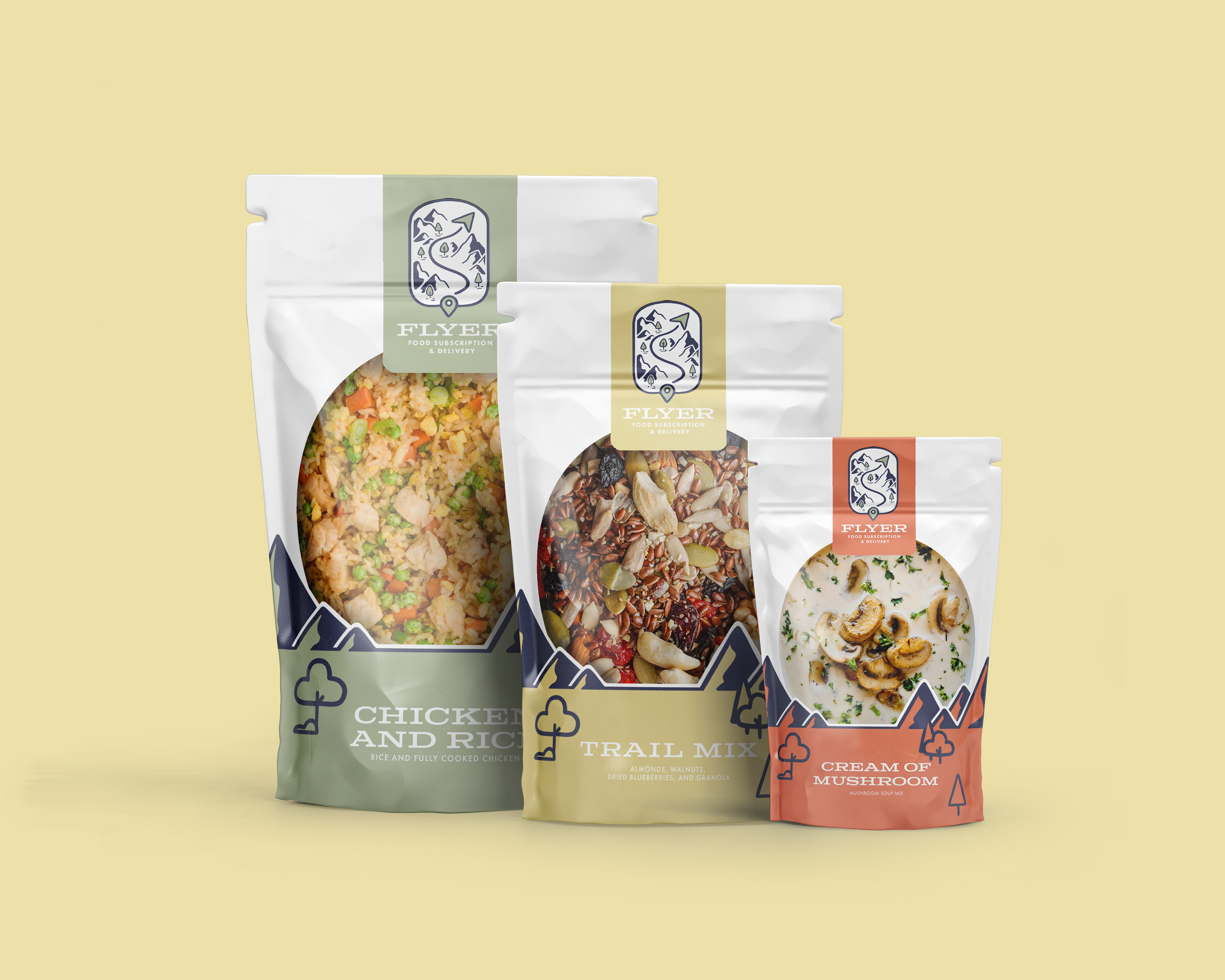
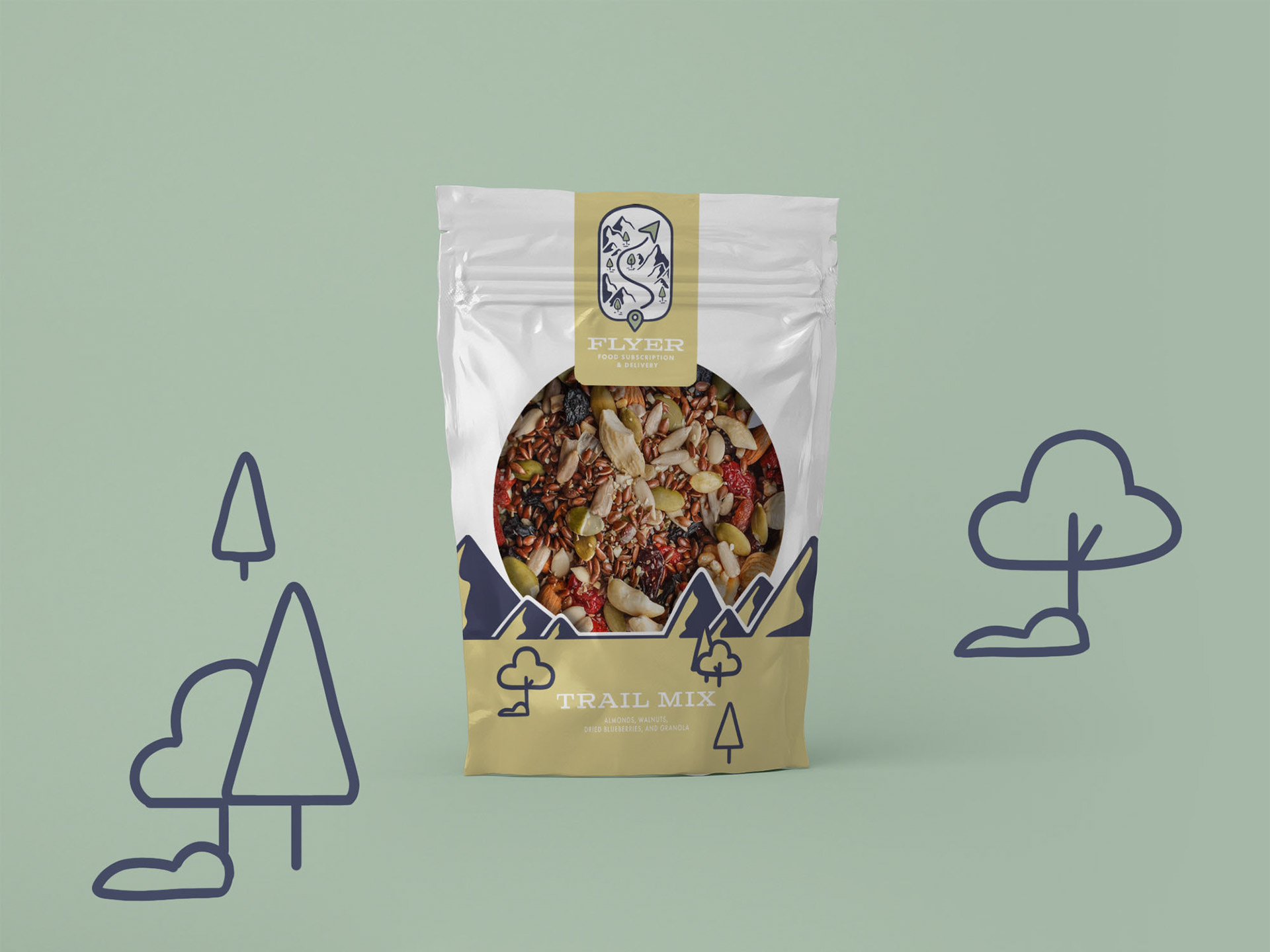
Branding, Packaging, App Design
Brainstorming
The idea for Flyer originally came from my desire to create food trucks that were located around the entrances of popular hiking spots so hikers had access to food when reaching their next stop. The further I developed my idea, however, the more problems I ran into. For example, what if some hikers did not carry money on them? How are the trucks getting to some of the more remote locations? Would lack of power be an issue?
As I was brainstorming, I discussed some of the issues I was running into with my dad, who used to hike often. He told me how he would sometimes mail packages of food to post offices that were near to trail entrances for his friend who would attempt longer hikes. I liked this idea, but what about hikers who couldn't rely on this dedicated service? I came up with the idea of a subscription service specifically for hikers in this predicament.
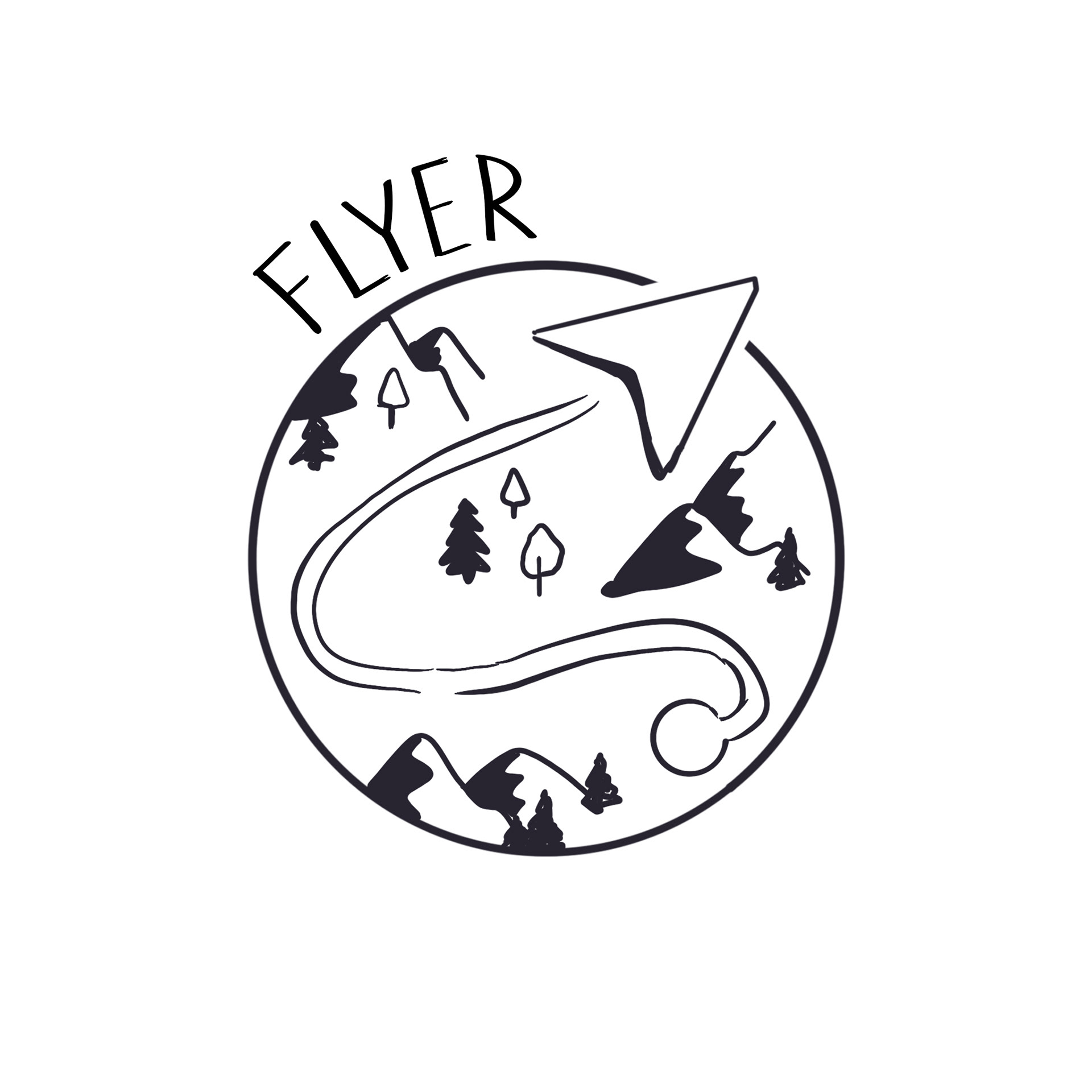
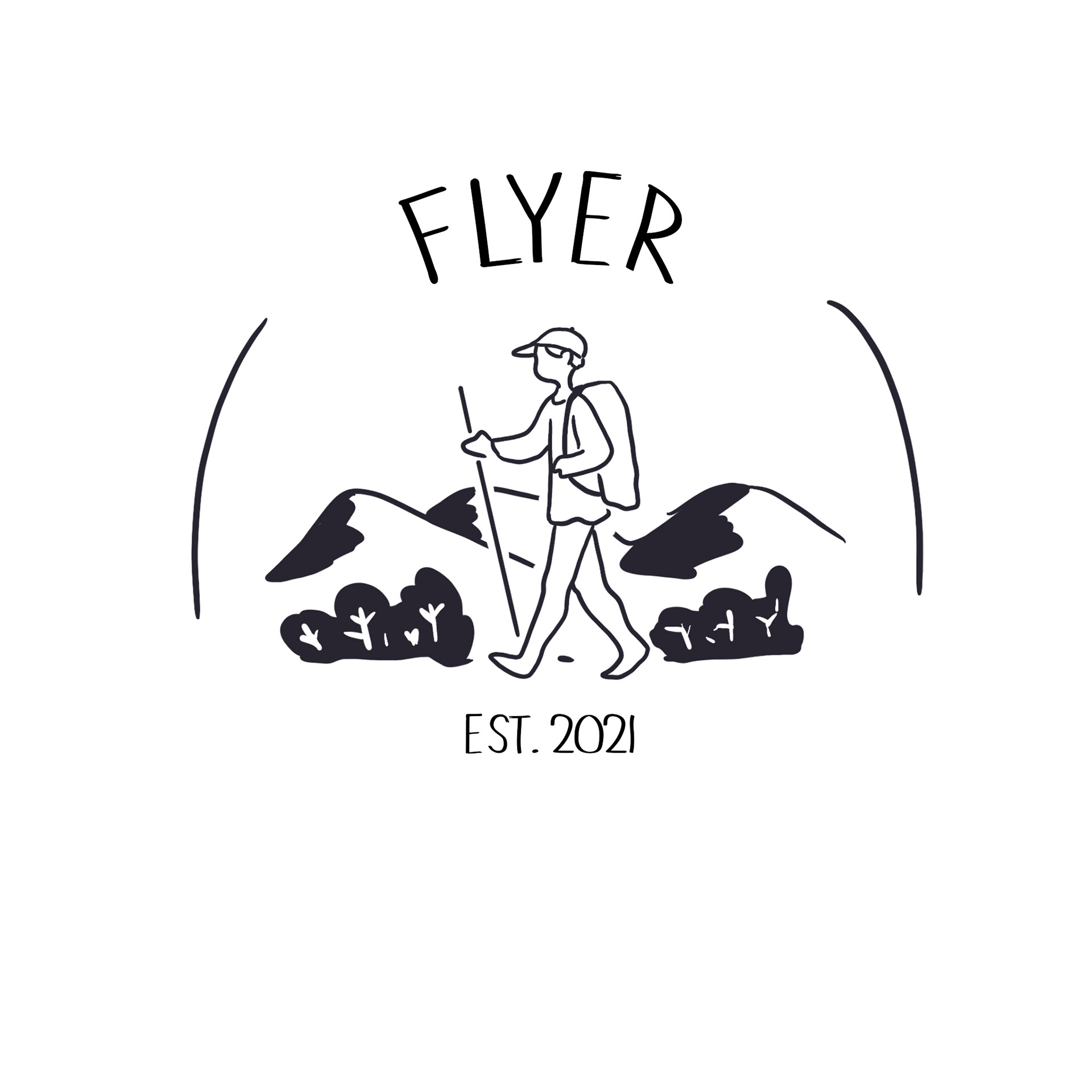
Logo process
I was heavily inspired by the design of simplistic vintage maps as well as scouting badges for this project. I also knew I wanted something that would appeal to a wide variety of hikers both young and old. I have friends and family of all ages who enjoy hiking, so I was able to design with a wide range of people in mind.
Color Exploration
After choosing a logo, I experimented a lot with color. In the end I went with a more simplistic and dusty color palette that reflected the hues and tones of vintage outdoor branding. I felt that this choice would help the branding be more versatile on a variety of products.
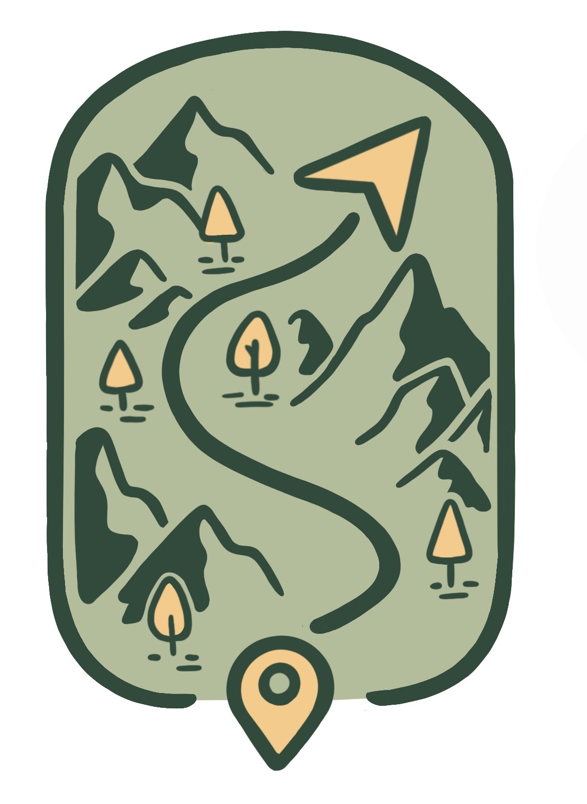

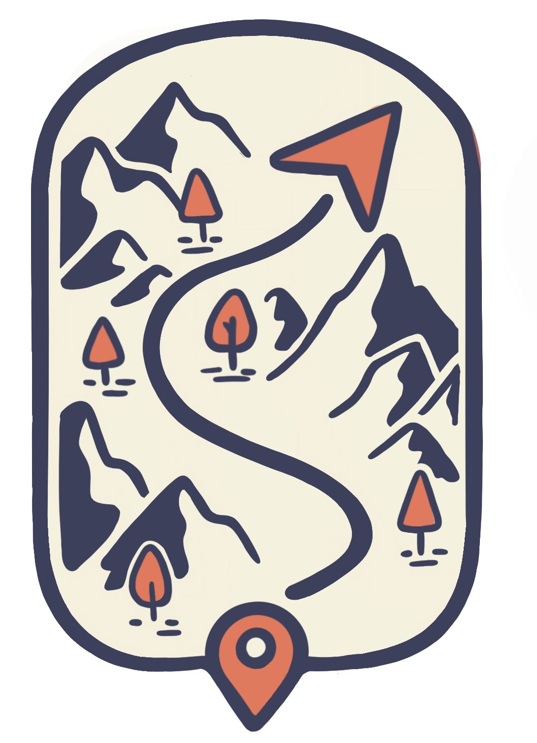
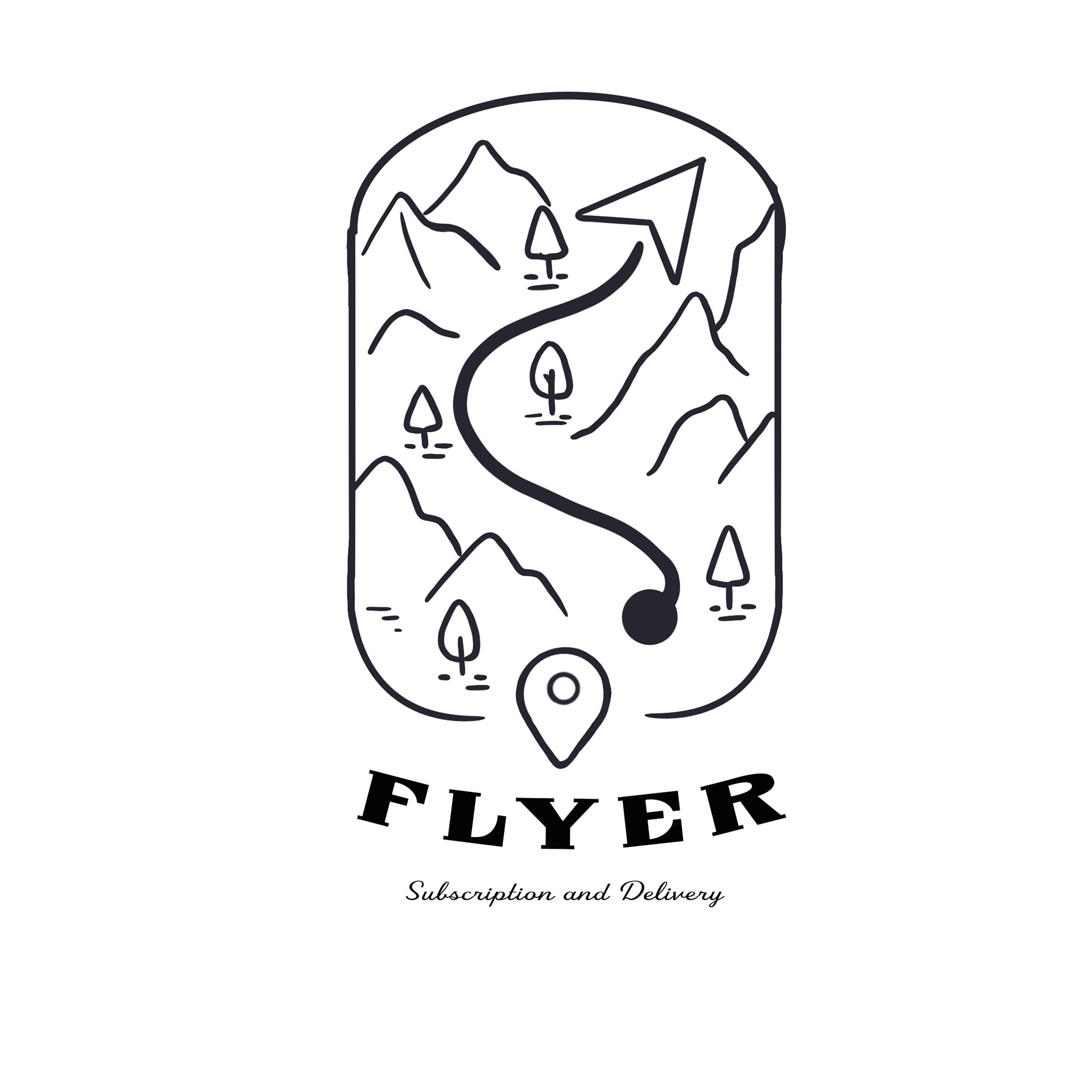
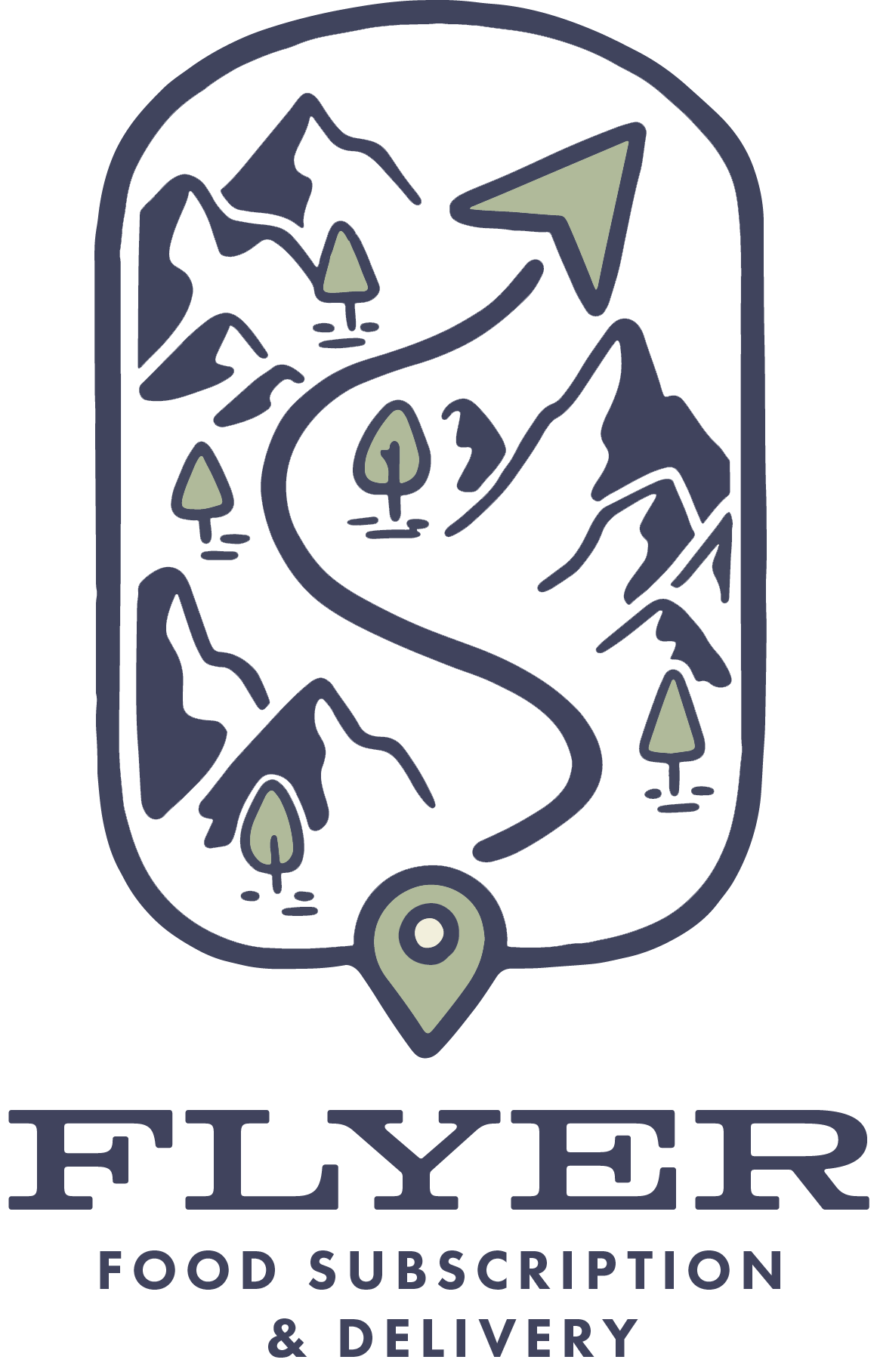
Final Logo
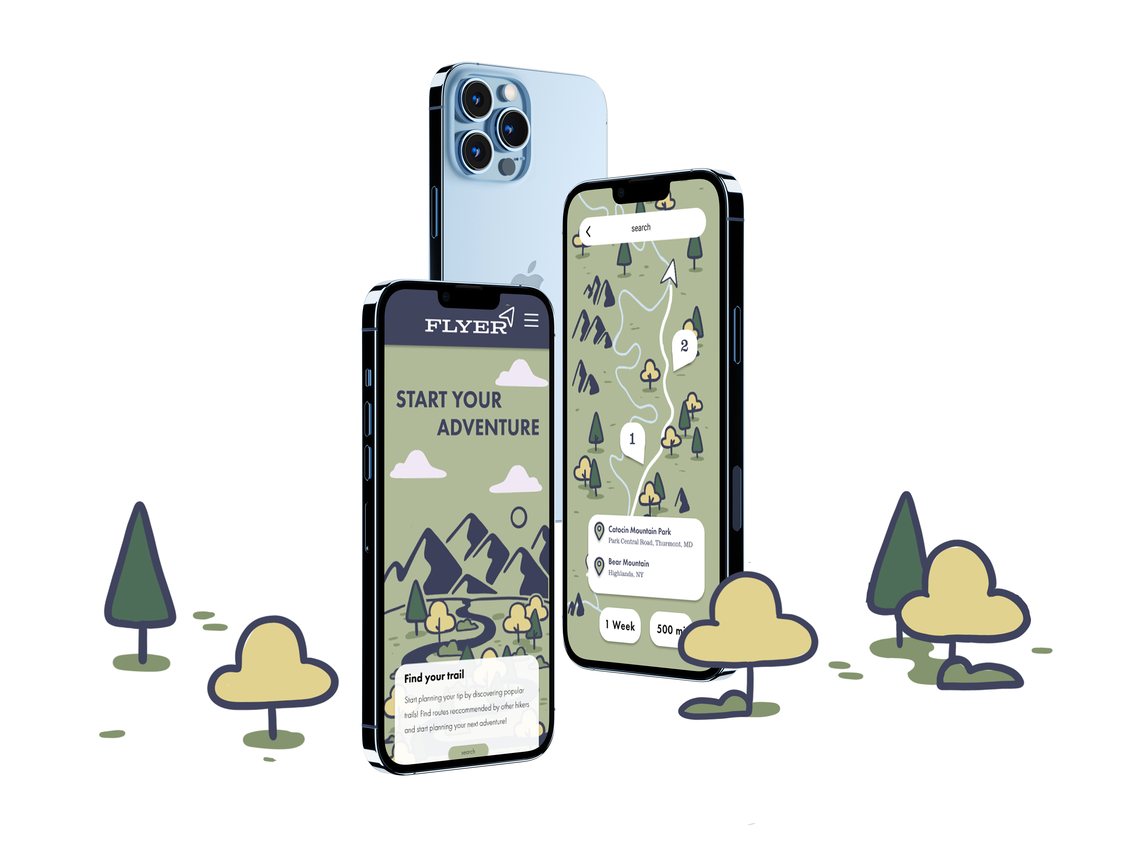
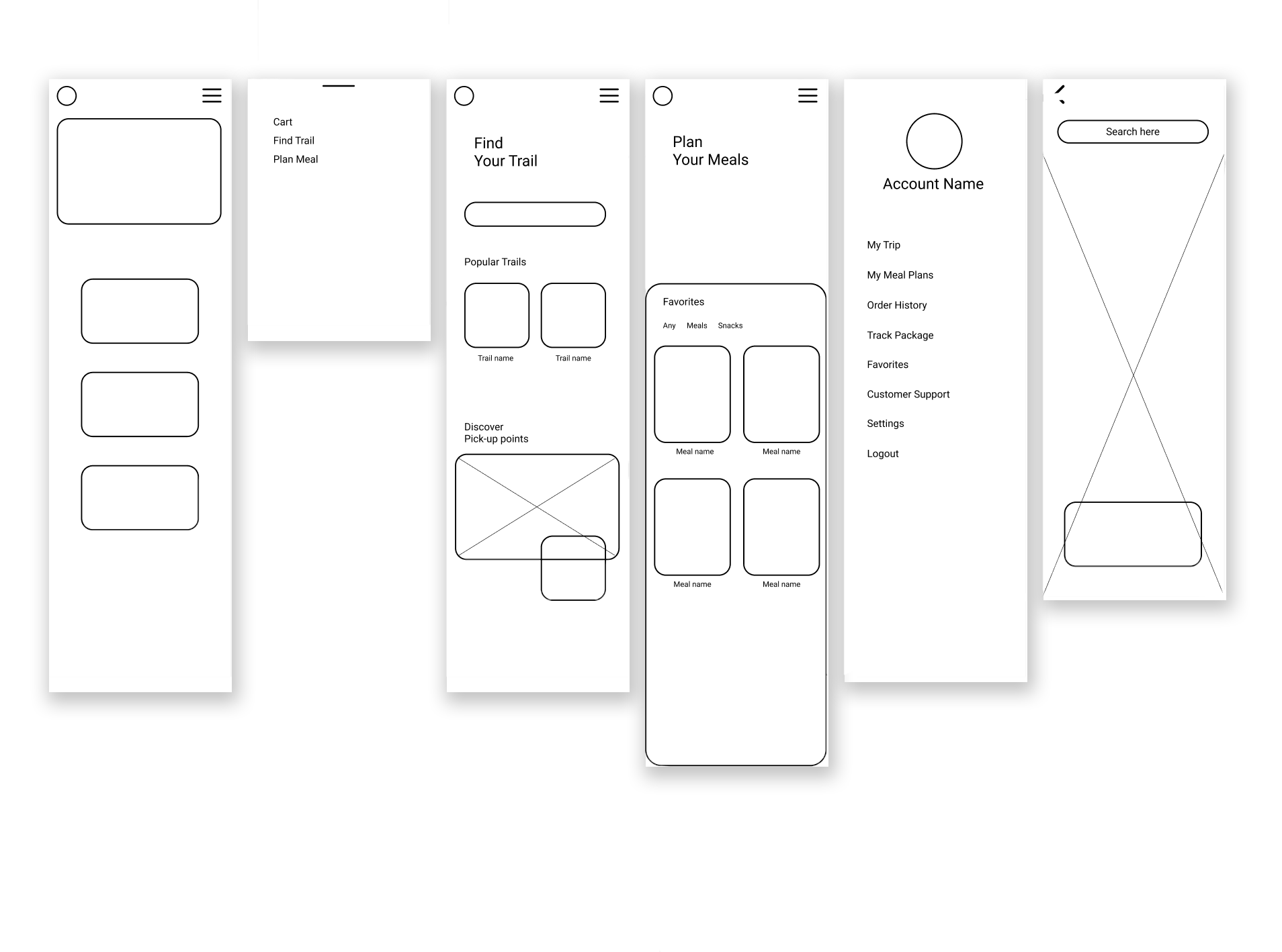
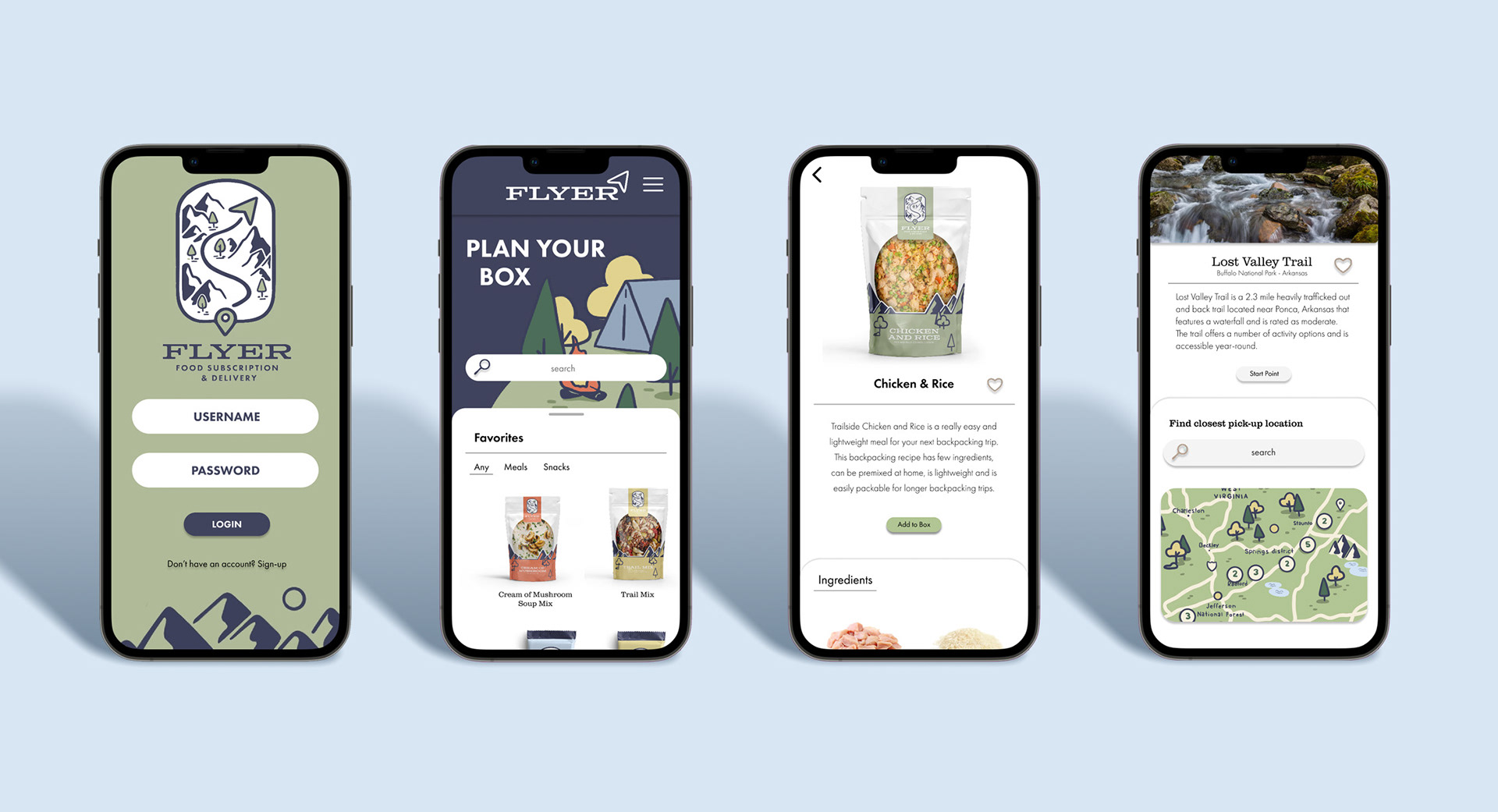
Creating the App
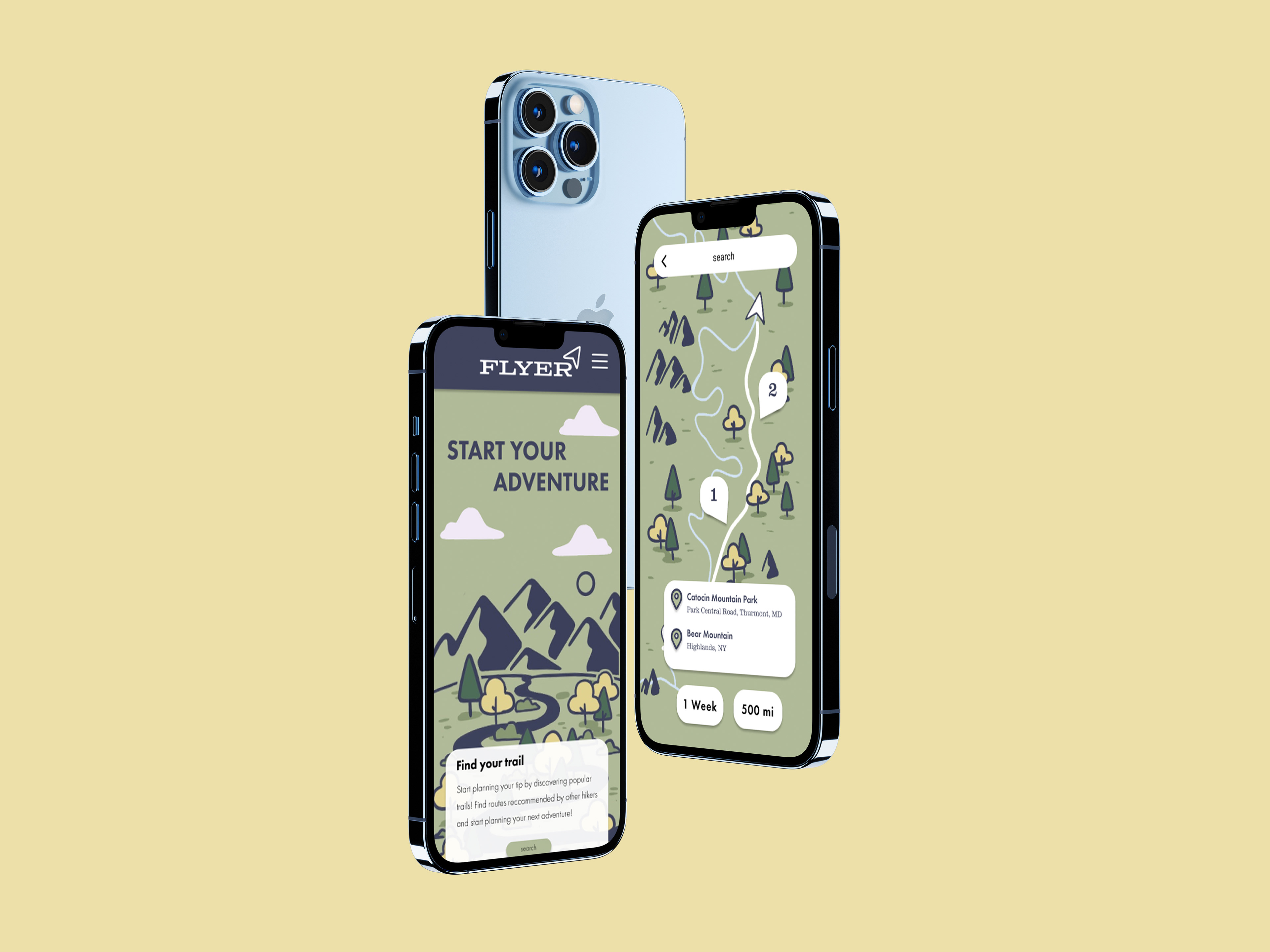
The main pages I knew I wanted to create were an instruction page, a page for finding trails, and a page for putting together your order....
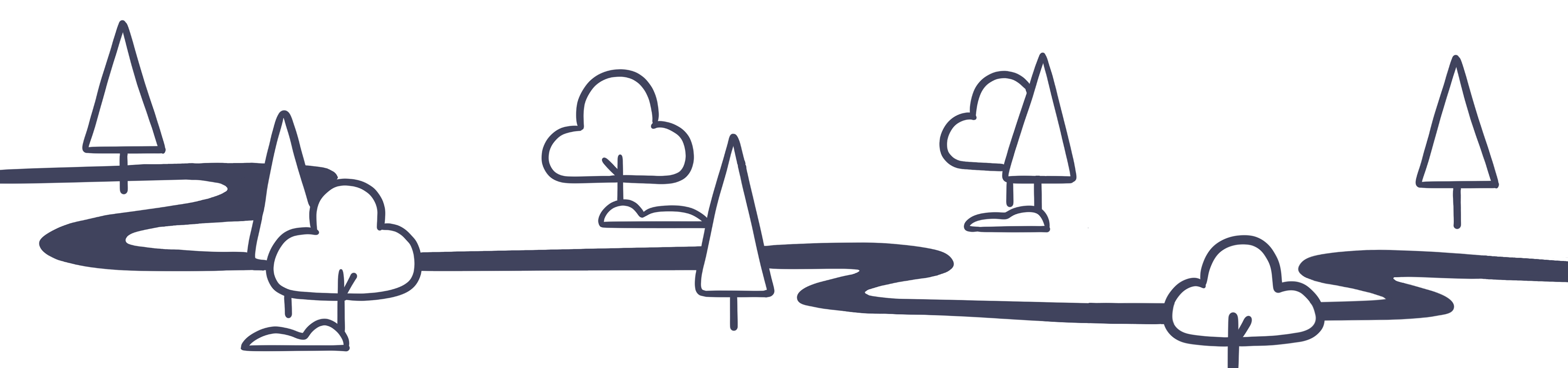
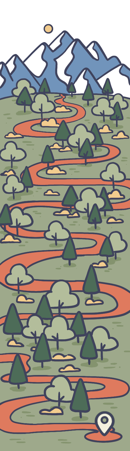
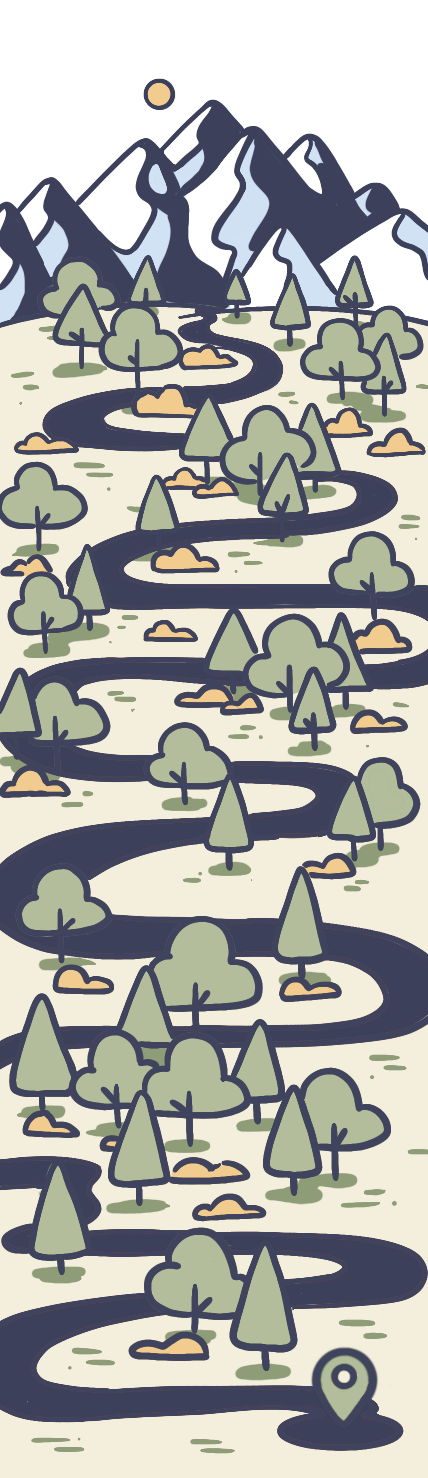
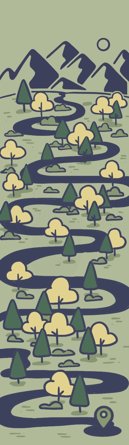
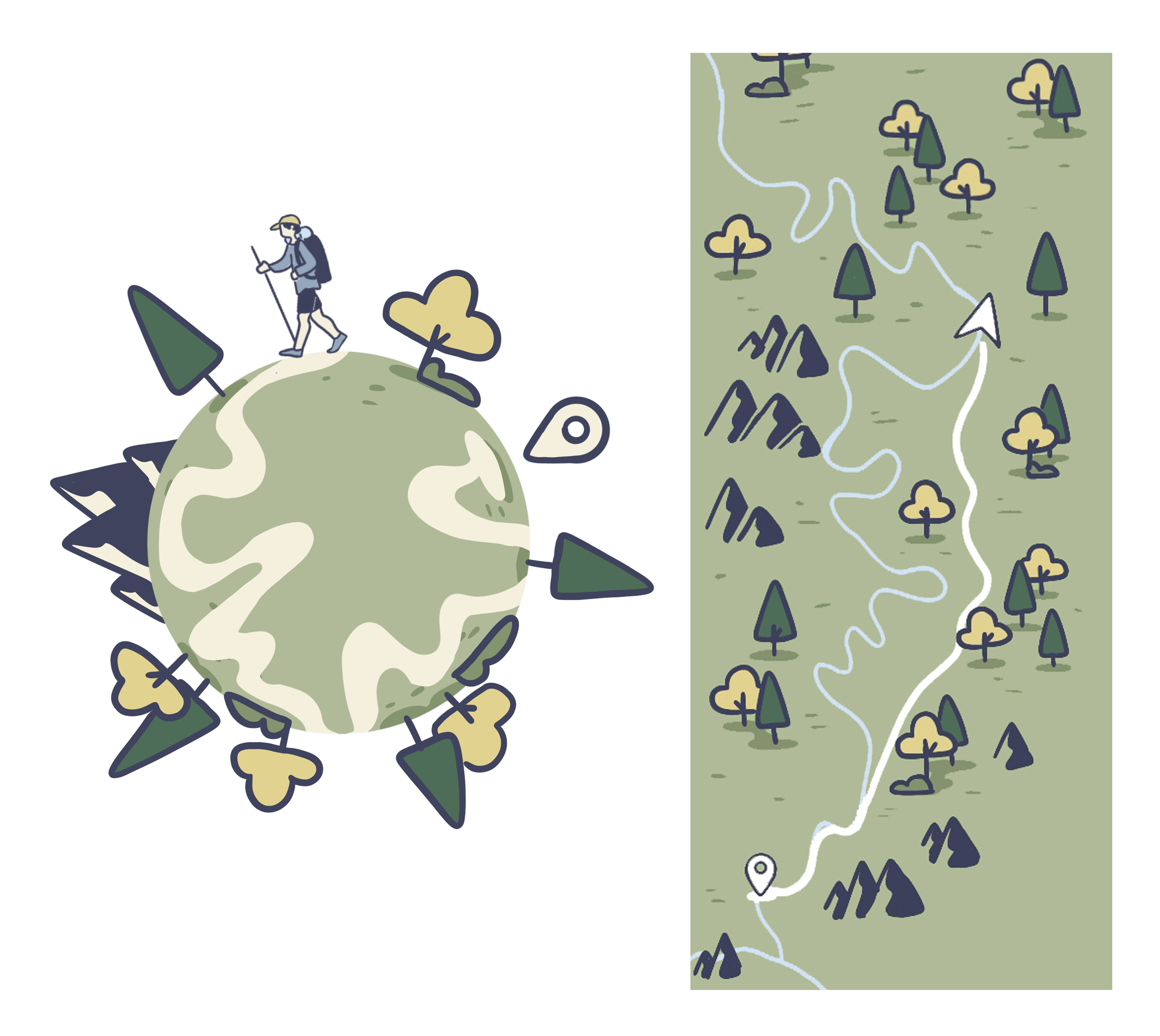
Illustrations
I experimented around with incorporating illustrations into the app in different styles and colors. I knew pretty early on I wanted a larger illustration of a winding path that took the user through the instructions of how the app worked, but it was after deciding on a logo that I had a clear direction for the style of illustrations.
Final Thoughts
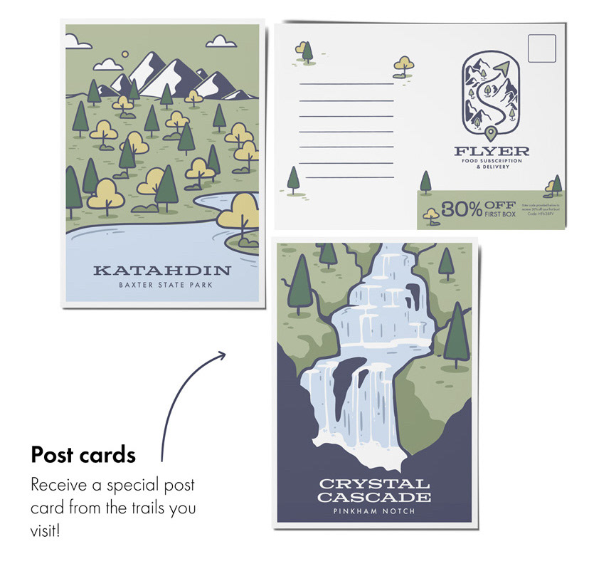
I hope to continue working on this brand in the future and add a lot more from app features to more products and even drop off boxes for hikers to throw away any packaging before heading back on the trail to reduce waste left behind and so packaging can be properly recycled. I also plan to work on a function feature in the app that allows hikers to properly plan a trip and help recommend convenient spots for pick up. I believe there is so much more I can do with this brand, and I hope to work on it further in the near future.